Anemoia for MediaWiki
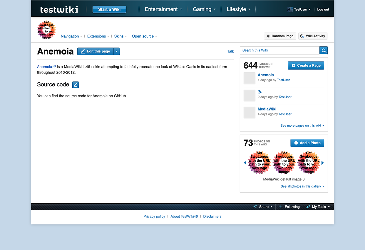
Anemoia is the name of a MediaWiki skin I 'created' a few months ago (September 2026). That's when the image you're seeing above was taken. I got to around 90% complete with the skin and subsequently stopped working on it; it's fully functional! Only some visual inconsistencies remain, but they're very minor, and you'd definitely need a reference image to be able to tell. At a glance, I'd assume they're identical.
Half of the people that read that opening paragraph understood it completely, while the other half is probably very lost right now. I'll fill you in. Anemoia, my first MediaWiki skin, is a careful and faithful recreation of how Oasis looked like in 2012. Well, 2010-2012 exactly. Oasis was the previous skin Fandom.com used during 2010-2021, prior to FandomDesktop. This skin recreates the earliest version of Oasis in depth. While not perfectly 1:1, it is fully functional* and runs smoothly on a modern MediaWiki 1.46 instance. If you're perceptive, you might've also noticed the testwiki wordmark's resemblance to the old wikia logo; that was not a mistake.
Functionality
When I say it's fully functional, I'm mostly referring to the things that aren't decorative. For example, the search button, page/photo buttons, the edit button/actions, the share dropdown, and the tools panel all work. Although, I wasn't able to find a video of the actual tools bar in action, so I took a best guess based on the modern skin. However, the 'Start a wiki' button leads to whatever link is configured, and the dropdowns are filled with static content. I believe that it actually used to update quite frequently. It mostly looks the same, style-wise, there's also an easter egg in there, and it's configurable too.
It uses real avatars from IntegratedProfiles' service and implements it into the header where the real Oasis skin did. Hovering over the cutout also activates a dropdown with real links. The log out button is also real.
I tried to keep the small details, like the edit button being "Login to edit" when the user is logged out, but they may not be conclusive.
The thing that doesn't work is the old Discussions button and counter. I don't have that and I don't know how it worked, so I can't replicate it here.
The rest of the skin implements modern Codex design tokens and colors, so any extension looks like modern Codex by default. That's true with IntegratedProfiles, although I'd argue default Codex looks a little old compared with what I use regularly. Given half of my test wiki is meant for Citizen, this does break some templates' styling, but it doesn't matter too much.
Research
The best part of making this was the research. There's something about the old web that interests me. I don't remember it, even though I know I experienced it. Everything is different but along the way it felt like nothing was changing. I found a lot of old YouTube videos and forum posts from the time, even one discussing the change.
Anyway, I mainly used old Archive.org snapshots and YouTube videos which showcased the interface at that time. They were mostly consistent with each other, but I did notice the interface shifting over the timeline.
I made the edit icon vector by hand, and the rest were derived from/are Google Material Symbols 3 icons.
Logo
The logo was also a separate bit of research. The old Wikia logo/workmark used the Montserrat Alternatives font, with modified i glyphs to resemble the square brackets from wikitext markup. That's what I also used with the testwiki wordmark, and I morphed the font by hand (in Figma).
Inconsistencies
There's some inconsistencies I'm aware of. For one, the main header had some styling on the edges I quite don't understand how to replicate yet. I think they were going for a 3D effect. The share button has yet to be redrawn faithfully (it currently comes from Google Material Symbols 3). Some JS features were broken in the snapshot, but I believe they behave similarly. There's some minor styling off in other places, but I don't believe it to be noticeable. I also went with blue instead of any other color because I believe that is consistent with Wikia's default branding, but I believe sites could customize the accent color at the time. I remember seeing a yellow edit button and getting confused as to why the skin kept changing so frequently (I was going between the WOWiki and the Fallout Wiki).
Naming
Anemoia refers to the feeling of Nostalgia for something you never experienced, or a time or place a person has never personally experienced or remembers. Funny enough, this word was also created in 2012. I didn't use (then) Wikia at the time, so I thought the name was fitting. This won't be the same for everyone, though.
Release
I've thought about a release before, but I don't really see a point. It's cool to look at and point at, but no one should realistically be using this. It's funny to see a random wiki look like 2012 Wikia, though. I wouldn't say never, but I wouldn't count on it either.
So, that's 2012 Oasis for you! Well, roughly. Maybe I'll share some design files later. I'll hopefully have some more benchmarks to talk about with ManticoreSearch later, too. That's it!
P.S. There's a weird bug with my renderer that caused a colon nested inside of letters to produce another colon at the end of the word like s:o:, even though I only typed s:o, so that's why I formatted it weirdly in this post.